For those of you who don't know Brian, he's an awesome dude with a lot of insight. His youtube channel is really interesting, and his web/identity design agency has done some really big work like the Fishers Net Awards. We did a podcast with him here.
Brian did some pretty groundbreaking work on this logo mockup, and I say that for the following reason:
Heraldry is super Catholic, but we haven't adapted it to the digital age.
The coat of arms was the original logo. It was the way we communicated the essential identity of organizations, always painted big and huge and intricate on shields, walls, and banners. It spoke in a language of symbols that was common and understood by all. Now a few hundred years later we're in the digital age, the age where logos are generally represented in tiny corners of webpages and printed on the corner of fliers in black and white. The banners that we rally behind now are logos, and those logos have to be used in a few different ways:
- It needs to reflect your organization’s why in a single simple form.
- It must be distinguishable in positive and negative. This necessitates the use of negative space.
- It must be able to be represented in black and white
- It must be distinguishable at the size of a penny, and still look amazing blown up on a billboard
- It must last for at least 20 years, but probably more.
The rest of the world has generally caught up to these needs, but Catholic Dioceses never got the memo. Here's what most Dioceasan logos look like:
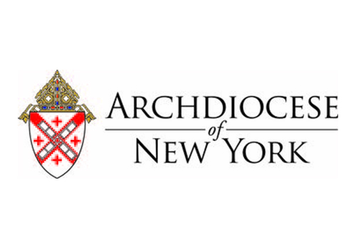
Here's what it would look like in a single color if it was on a poster we designed for Exalt, a young adult group in Dallas:

What's amazing about this is that the "Exalt" logo is actually SMALLER than the diocesan logo, the diocesan logo is unreadable at this size. Heraldry is still rich and amazing, but it needs to be done differently in order to work as a logo.
That's why I love what Brian did with his. It works at small sizes, but looks awesome blown up, and it's easily viewed in greyscale. This is his logo used in the same poster at close to the same size as New York's.

Brian, you win again. Good work man.